Make it happen, use recklessly.
by saltypond
This work has been commented by 1 curator(s). Read the comments
Title
Make it happen, use recklessly.
Headline
Commondebt Bank
Concept author(s)
Casey Pinkerton
Concept author year(s) of birth
1992
Concept author(s) contribution
The concept for this work was developed and refined by Casey, after many sketches, ideas and a lot of research the idea was settled upon. And developing begun.
Concept author(s) Country
Australia
Designer(s)
Casey Pinkerton
Designer(s) year(s) of birth
1992
Designer(s) contribution
The design of this work is what makes the concept so strong. After the concept was developed into a strong idea the design process begun and during this time ideas were refined and the final product was created from sketches to screen and print.
Designer(s) Country
Australia
Friendly Competition
Competition category
Visual communication practice
Competition subcategory
static
Competition field
academic
Competition subfield
student
Subfield description
University of Ballarat
Check out the Debt. 2012 outlines of Memefest Friendly competition.
Description of idea
Describe your idea and concept of your work in relation to the festival outlines:
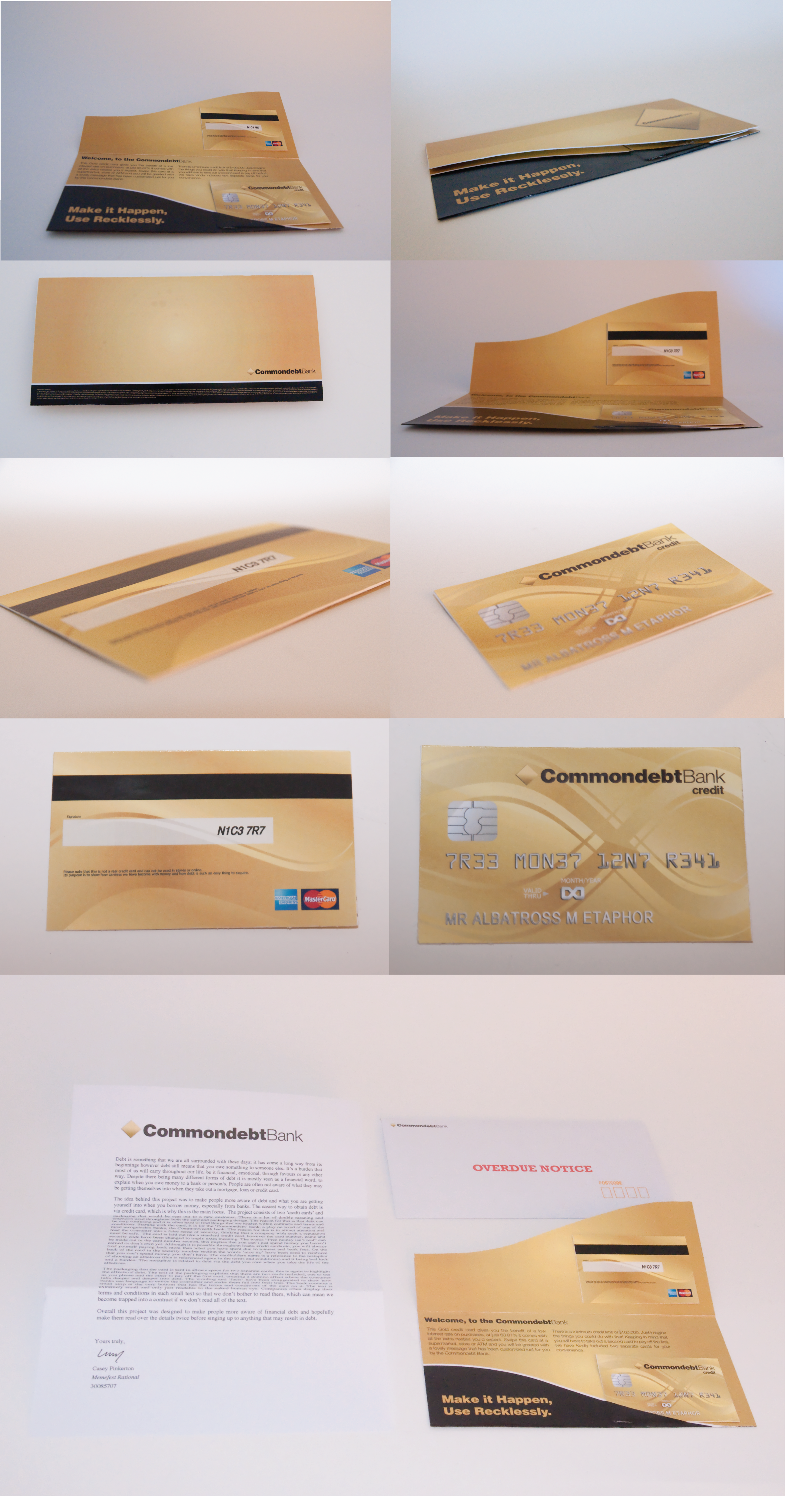
Debt is something that we are all surrounded with these days; it has come a long way from its beginnings however debt still means that you owe something to someone else. It’s a burden that most of us will carry throughout our life, be it financial, emotional, through favours or any other way. Despite there being many different forms of debt it is mostly seen as a financial word, to explain when you owe money to a bank or person/s. People are often not aware of what they may be getting themselves into when they take out a mortgage, loan or credit card.
The idea behind this project was to make people more aware of debt and what you are getting yourself into when you borrow money, especially from banks. The easiest way to obtain debt is via credit card, which is why this is the main focus. The project consists of two ‘credit cards’ and packaging that would be sent out to a new customer. There is a lot of double meaning and emphasis used throughout both the card and packaging design. The reason for this is that debt can be very confusing and it is often hard to find things that are hidden within contracts and terms and conditions. Starting with the card, it is for the ‘Commondebt’ bank, a play on word of one of the most recognisable banks, the Commonwealth bank. The reason for this is to attract attention and lead the consumer into a false sense of security, thinking that a company with such a reputation must be safe. The card is laid out like a standard credit card, however the card number, name and security code have been changed to imply extra meaning. The words “Free money isn’t real” can be made out in the card number section, this implies that you can’t just spend money you haven’t earned or don’t own yet. Although it is possible throughout loans, credit cards etc, you will always find yourself paying back more than what you have spent due to interest and bank fees. On the back of the card in the security number section the words ‘nice try’ have been used to reinforce that you can’t spend money you don’t have. The cardholders name is a reference to the metaphor of shooting an albatross (this is referenced again in the terms and conditions) and it being bad luck and a burden. The metaphor is related to debt via the debt you owe when you take the life of the albatross.
The packaging that the card is sent in allows space for two separate cards, this is again to highlight the effects of debt. The text of the packaging explains that there are two cards included, one to use as you please and the other to pay off the first card, creating a domino effect where the consumer falls deeper and deeper into debt. The wording and ‘facts’ have been exaggerated to show how banks use language to entice the consumer and make them fall into their trap. The back contains a small strip at the very bottom that has the terms and conditions of the card on it. The text is extremely small and only just readable to the naked human eye. Companies often display their terms and conditions in such small text so that we don’t bother to read them, which can mean we become trapped into a contract if we don’t read all of the text.
Overall this project was designed to make people more aware of financial debt and hopefully make them read over the details twice before singing up to anything that may result in debt.
What kind of communication approach do you use?
The communication approach used resulted in an end product that could be printed and letterbox dropped to households anywhere in the world. The work was designed to make people more aware of debt, in particular focusing on the financial side that is seen so commonly these days. The design was created to mimic that of a real bank, and then to explain in easy to read and exaggerated terms how debt is accumulated. The use of different elements that feel tangible and real creates more interest and gains more attention than a simple document would.
What are in your opinion concrete benefits to the society because of your communication?
Society could benefit from this design as it will raise awareness of financial debt and also make people more aware of what exactly they are spending. If people didn't fall into the trap of debt so easily they may have more funds to spend in their local community, which would continue to benefit them and the people around them.
What did you personally learn from creating your submitted work?
I learnt a lot completing this work. Commercial design can often become dry and boring, but trying to create something that looked professional and would still grab attention pushed me to take my design further. I also learnt a lot about debt, and that although these days it is associated with finances, debt can be obtained in other ways from emotional to small favours and objects.
Whilst researching I found that banks often use persuasive writing to market their products and hide important details, not everybody knows to look further for more details and conditions before signing a contract, and the fact that corporations can get away with this is unfair.
Why is your work, GOOD communication WORK?
I believe that my work is a good piece of communication because it looks professional and is something easy to read. By doing letterbox drops the work is dispersed across a wide range of people. By using design that is already seemingly well recognized it will draw peoples attention and be read. The design is simple and easy to follow, yet also contains hidden messages for those willing to look into it further.
Where and how do you intent do implement your work?
My work is designed to be sent out to households around the country.
Did your intervention had an effect on other Media. If yes, describe the effect? (Has other media reported on it- how? Were you able to change other media with your work- how?)
Curators Comments
Roderick Grant
Another proposal that serves as a legitimate basis for future work - the intent must be, however, to actually mail this out, and perhaps harvest some kind of feedback/participation from recipients.
As a subversion of the plethora of credit card application notices that arrive to household around the world, the question begs to be asked - why create the fictional bank vs. using the format as a delivery device for content. The envelope, the application, the letter from the CEO, the brochure/marketing collateral - all of these formats can serve alternative purposes other than their original or intended communication outcomes.
The "fiction" of the proposal need not be the lead, but rather take the form of actual information about what the jargon surrounding such credit card applications actually mean. Does anyone actually understand what an APR is? How it is actually calculated? How late fees are accrued? All of this data, made visual, made literal and up front does not need a fictional cover, but only needs to be explained in clear, direct language, verbally and textually throughout the proposal.
The more that a proposal pays attention to the conventions and tropes of an existing form, the more, perhaps, it risks being dismissed as "just another of the same". The attention to the typographic, colour and other formal cues inherent in financial design systems in this instance might just be a hindrance. While immediately convincing, the content that is "to the point" and truly subversive, seems to be hiding, almost lost within the dictates of the original order.
Looking at the work of Richard Saul Wurman, Understanding USA or his ACCESS books (dated, but still good) would life the lid of the many routes of clarity open to explain truly complex financial relationships and agreements. As an initial gesture, there is much work to be done in Use Recklessly, but work that is very much worth doing to the package, and its tracking through the entire system of its delivery.