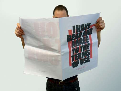
I have NOT read and agree to the terms of use.
by clebercampos


This work has been commented by 5 curator(s). Read the comments
Title
I have NOT read and agree to the terms of use.
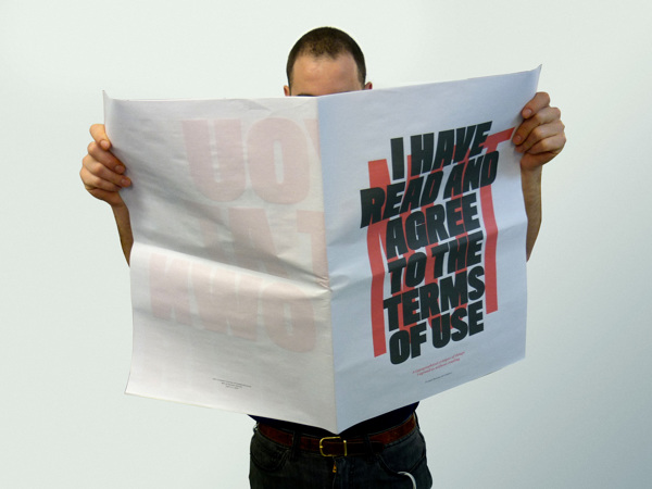
Headline
A typographical critique of things I agreed to without reading.
Concept author(s)
cleber rafael de campos
Concept author year(s) of birth
1987
Concept author(s) contribution
Research and design.
Concept author(s) Country
Brazil
Designer(s)
cleber rafael de campos
Designer(s) year(s) of birth
1987
Designer(s) contribution
Research and design.
Designer(s) Country
Brazil
Other author(s) Country
Brazil
Friendly Competition
Radical intimacies: dialogue in our times (2014)
Competition category
Visual communication practice
Competition subcategory
static
Competition field
academic
Competition subfield
student
Subfield description
MA in Graphic Design / University of the Arts London: London College of Communication
Check out the Radical intimacies: dialogue in our times 2014 outlines of Memefest Friendly competition.
Description of idea
Describe your idea and concept of your work in relation to the festival outlines:
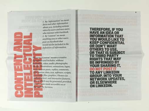
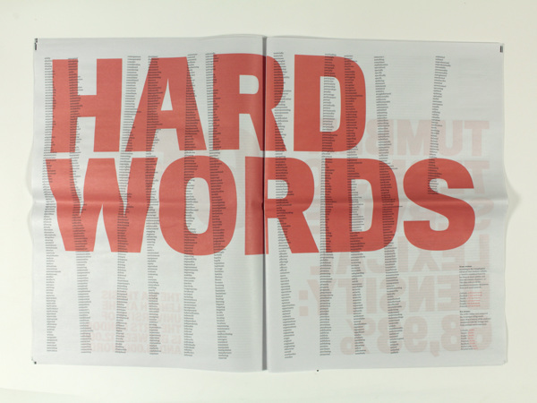
Despite the internet is a place for freedom of speech and participatory culture, most of our time online is passed inside the walled gardens of social networks.
In my project I meant to show that you are just as free online according to the corporations rules you network with.
What kind of communication approach do you use?
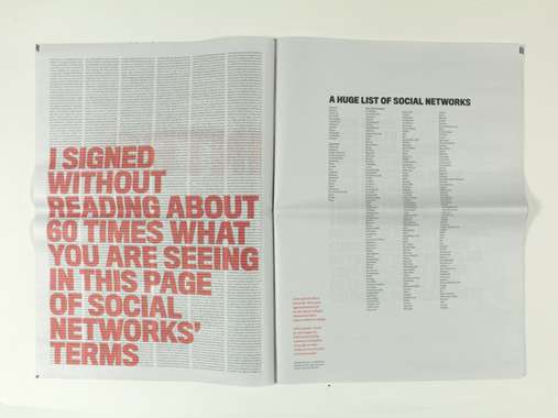
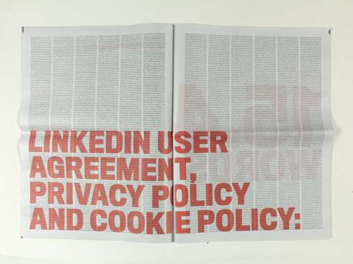
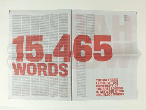
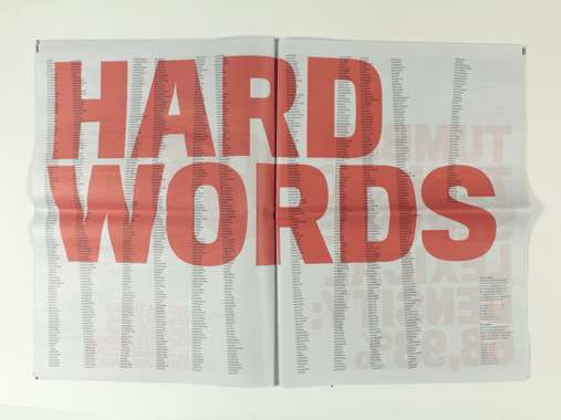
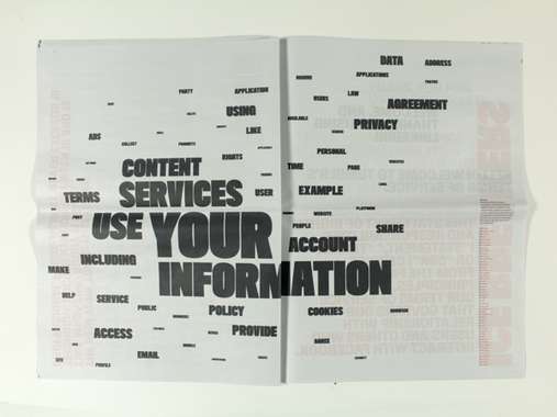
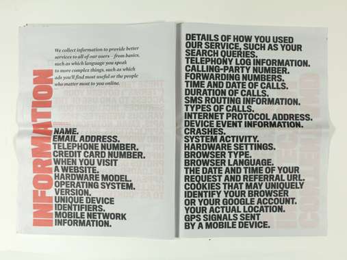
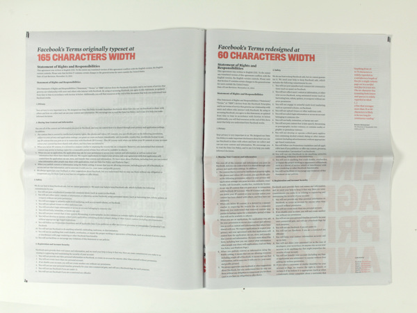
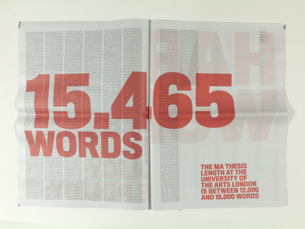
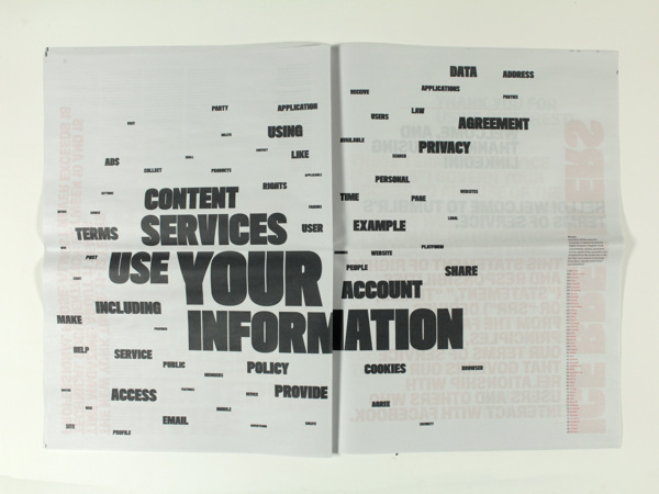
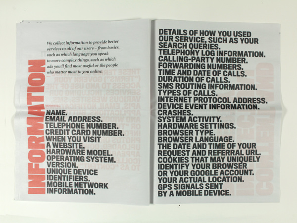
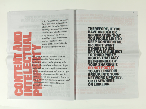
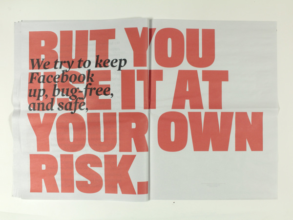
It's a newspaper that has the aim to make explicit the content inside top 6 social network's terms of use. Project divided in three steps: 1. mapping of existing social networks and the ones that i am part of; 2. analyzis of the six most popular (Facebook, Twitter, Linkedin, Tumblr, Google+ and Pinterest) regarding format and content; 3. response creating this visual piece that highlights some key points of the research.
What are in your opinion concrete benefits to the society because of your communication?
Understanding of the media and development of critical thought.
What did you personally learn from creating your submitted work?
I learnt some dirty tricks used by the corporations, such as using bad layouts on purpose to discourage reading.
Why is your work, GOOD communication WORK?
Because it explores a complex subject in a clear way, taking out all the distraction to analyse individual points. In doing so, it makes explicit things that normally are not paid attention.
Where and how do you intent do implement your work?
I created just a small number of editions of the newspaper. I intend to print a larger number if I find sponsorship for it.
Did your intervention had an effect on other Media. If yes, describe the effect? (Has other media reported on it- how? Were you able to change other media with your work- how?)
No.
Curators Comments
Dr Zoë Sadokierski
Why use a newspaper format for a project about digital media?
The newspaper format works well – I understand how 'dense' a spread of newspaper text is, so seeing the extremely long texts here make them suddenly more shocking – scrolling on screen doesn't give a sense of just how long these policies are in the same way that seeing them in this printed format does. It's clear there is significant research and thought behind this project, and that your design has been driven by the research you conducted.
The typography is refined and engaging – this is exactly the sort of publication that designers would pick up, but it also has universal appeal because the general public understands the 'visual language' of newspapers. In other words, the format you have chosen makes the content more accessible to a broad audience.
Showing us something familiar, with a twist when we look closer, is a powerful communication technique.
Why is this work unsettling?
This work makes me uncomfortable, because I agreed to almost all of these site's terms of use without reading them. It is a topical issue, and you have addressed it in a way that makes a point without making me feel you are preaching or lecturing me about my laziness in not reading these policies. In fact, you give me reasons why I don't do so (the small print and difficult text navigation that seem to be strategies on the part of some sites).
Where would these newspapers be 'found' in the world?
If you want to print a larger quantity of these, through sponsorship, you need to consider who your market would be (how do you get people to buy them?) and how you would distribute them (practically, how would people buy them and how would you send them to the buyers?). If you want them distributed for free, who would sponsor this (a legal service, a copyright agency?) and where would the newspapers be left for people to find?

Kevin Yuen Kit Lo
Interesting approach to the theme and the way social media frames our interactions. The visuals are quite well resolved and show a great command over basic design principles. The high contrast visuals and straight forward layouts produce an accessible environment within which to explore the themes brought forward. The simplicity of the visuals participate in making the message clear and powerful, sometimes even humorous, and allows for an easy visualization of how much our interactions are regimented within online ‘social’ spaces. You achieved your aim and showed in a very effective way how the way information is framed affects how we interact with what is presented. You manage to open up an opportunity to develop a new, enlightened perspective of the "social" spaces within which we interact frequently.
You did an excellent job at making the content of the terms of use explicit, but the project has the potential to participate in making even more tangible the extent to which our social universe is regimented as you only hint at the existing control mechanisms. For example, a more in depth analysis of the impact of specific clauses could have made more obvious the lack of privacy existing within the medias we use in often very personal ways, as well as the problematics involved in such a lack of privacy.
If you were to continue developing this concept, I suggest you include discussions on how our intimacy (or lack thereof) is impacted by an environment largely controlled by corporate interests. I wonder if you could explore how this framing affects the way we interact and expose its direct impact on how we communicate; how the specific structure of social media sites impact the way we see ourselves and others, or limits our emotional connection. This addition could serve your project by adding a social dimension to your arguments. Effectively, the precision and ease with which you navigate within your topic is commendable, but you very successfully work only within a small portion of a larger issue which is of great importance. The absence of the aspects of your topic listed above make me believe the project is somewhat unfinished, or at least that it is a start to a larger exploration, and I would be really interested in seeing it be developed further.
Scott Townsend
I really liked this project because of it's strategies and the use of typography to express the ideas powerfully, both in typographic form and research, writing and content. It invites the reader to understand both a kind of editorial position you are taking and asks them to reflect and judge on the actual content which points back to Facebook et all. You are taking a 'showing' attitude in design and content- you speak to your audience from a clear, rational perspective, while reader response is generated by visualization of quantities, how you create themes in the writing and typographic interpretation.
Dialogue (based on branding/digi media and strategic positioning) for instance is now so ubiquitous and deployed so thoroughly, that while we participate in it, we also keep a distance to it. Typography, writing and essentially 'broadsheets', while being seen as historically dated are still strategies to be considered in certain contexts and audience. They are immediate, physical and public, and provide reflective experiences (ie they just don't disappear off of a screen for example- they take up space and are in your peripheral vision and environment when you are not actively reading them).
Revolutionary!
Alex Jordan
Dear Cleber Raffael de Campos
first please accept that my english is very bad (not in reading texts but in writing) so I try to give my best but I cannot go in deep grounds with my poor basical expressions.
A big paper. And little diffusion, looking for a sponsor... Facebook? ;-)
The alternative would be certainly an edition in bookform -and why not more background info around. I like the big size, a real postersize, but for a become a poster all the pages are not in usability for the instant. my suggestion is nevertheless
to re-work the concept, to strengthen it (less the form than the content), maybe introduce also images (are you only typographer? even than you can come to stronger diversity and somewhat more provocative pages). The siz could be questioned also in the other direction: to blow the pages up to 3x4m wall-papers.
The only risk (maybe) is... the use of all those names. (the anti-coca-cola posters make publicity pour... coca-cola, the well implanted, strong labels.
It's not a new problem, hundred of years ago, critics spoke about lions and sheep to denounce power abuse, aristocratic terror.
We all have to find new forms of subversion, new forms of solidarity, maybe beginning again to shake hands and meet in the bistro, face to face instead of exclusively on facebook.
Sincerely
Alex Jordan
Roderick Grant
As students of design, we all learn to sculpt, shape and otherwise manipulate typography for the benefit of the reader. Editorial Design, in this sense can become a far too technical pursuit, bereft of deeper significance and relationships built between specific forms of typography, and specific forms of content or meaning.
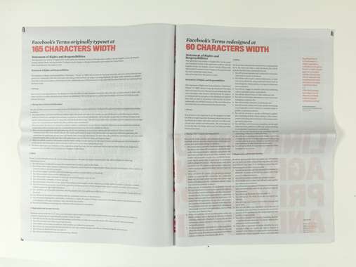
The editorial approach in this work plays successfully with notions of simple manipulations; column width, character counts and the like, but it does so with slightly higher stakes, freedom of information stakes.
The approach of taking the actual and real type of a legal user agreement as the substance of this exercise is wise and some of the observations in large scale 'captions' work well to call into question what we agree to when we click 'agree' or 'ok'. I feel that there are opportunities within the text to further call into question specific areas where a user's rights are undermined, denied or left ambiguous beyond the clear statements brought forward in the large scale red type. As with any editorial project, its a matter of patience and careful iteration, but this is a solid foundation.
The further opportunity here is to make the document live in a different sense, and to allow it to become more 'linked' to the content it seeks to critique. In this sense is HTML 5 a more appropriate form of typographic 'mark-up' than InDesign, or Quark, or any other tool that requires that you enter into an EULA (end-user license agreement)?
The relationship here between the doing of typography as a process of mark-up (pre-digital days of writing over plain sheets of type content with specific instructions for eventual typesetting) and the doing of code such as HTML, call into question the hows and whys of interpreting text as a visual form of communication. What you've done is to appropriate the newspaper, bringing online language out into the world of the physical, which is a good tactic. I'm also curious though, as to what potentials await you, if you were to deal with the text in its native form - online?
Many of the questions you could pose online in a web environment could work equally well as, perhaps in addition to, what you have initiated in this editorial study.
Could the addition of interaction allow you to say more about particular types of information being sacrificed through how a link or click behaves?
In an editorial sense, we use typography to communicate voice, and while this is true online, the additional layer of interaction, of behaviour, sound etc...allows us to 'feel' or experience your critique in a more animate and live form. Its not about form being in relation to function in any specific way, but form being allowed to function in ways that further critical communication, and to that end, you have a start, but could go so much further.
Illuminated manuscripts - and the contemporary work of Jonathan Barnbrook in particular - call forward deeper meaning by embellishing the page with illustration, caption and annotation. I wonder if an increasingly layered and nuanced approach to the environment you've created could push us to an even more pointed understanding of what we give away online?
11 years, 7 months ago
thank you so much by the comments, all really thoughtful and useful for further improvements. I will refer to some comments you made in a general way, since I believe they are connected.
this project was the starting point of my journey investigating social networks and their walled gardens.
Even though I knew that digitally it had the potential of achieving higher audience, I opted through the path of print design. In "I have NOT read and agree to the terms of use" the simple change of media proves itself as a strong rethoric device. In this case, just using type was a direct response to how terms and conditions are designed. I considered alternatives such as creating more user friendly approaches (such as illustrated infographics) but I felt that type by itself would be interesting enough.
since my are of interest involves the paradox of corporate monopolies X participatory culture, DIY culture and remediation, my project evolved more interestingly in offline ways.
I made some online experiments such as http://www.walledgardens.org/. It didn't work as expected cause I made the participation process too complicated and didn't create supporting material to advertise the initiative. Others experiments were also postponed due the lack of technical skills, tight schedules in my Master program which didn't enable me to complete them in a satisfactory way.
In another development since my submission for memefest,(https://www.behance.net/gallery/21259663/Skim-Scan-Read-Copy-Rec-Live) I created a conceptual zine to discuss these complex subjects from our network society. Here, I introduced images and more complex visual techniques than in my newspaper format. Also I avoided to talk specifically about Facebook, Tumblr or any other social network. As Alex Jordan comments about the association with names being an advertising way to them, not citing them also gives a longer life to the publication, maybe in some years they may not exist anymore, while the discussion about corporations X individuals, privacy, surveillance, life editing, virtual x real, information overload will be even more relevant.
All the research to these projects gave me a good critical basis that now I am trying to share in ways that can lead to action. I confess it is a hard process between acknowledging an issue and acting to change it, but that is what I am trying to do with these projects. Not in a way of dictating manifestos of how the digital world should be, but stimulating reflection through the process of making familiar things unfamiliar.
My challenges still reside in technical skills (to create digital projects, for example) and economic ones (to create viable ways of spreading without relying in third part money).
Thank you again for the selection and insights. I would be really happy to collaborate with the Memefest community in further projects, if there is interest, you can find me on behance.net/cleberdecampos.