Controspazio: Punti in Aria
by CONTROSPAZIO


This work has been commented by 1 curator(s). Read the comments
Title
Controspazio: Punti in Aria
Headline
Controspazio: Punti in Aria
Concept author(s)
Anne Bush
Concept author year(s) of birth
1957
Concept author(s) contribution
Conception, Design, Production
Concept author(s) Country
United States of America
Friendly Competition
Competition category
Mobilization
Competition field
academic
Competition subfield
educator/researcher
Subfield description
University of Hawaii at Manoa / Faculty of Art and Art History / Program: Design and Design History
Check out the Pleasure 2016 outlines of Memefest Friendly competition.
Description of idea
Describe your idea and concept of your work in relation to the festival outlines:
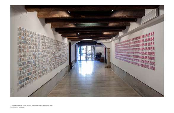
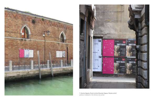
Contro Spazio: Punti in Aria [Counter Space: Points in Air] was a site-specific installation that was displayed in the SG Gallery [Venice, Italy] and on the streets of Venice, from July 7th to July 27th, 2015. The goal of the project was to use graphic design [specifically, the printed ephemera of tourism] to provoke visitors and residents of the city to consider the ways in which graphic design fashions an image of Venice.
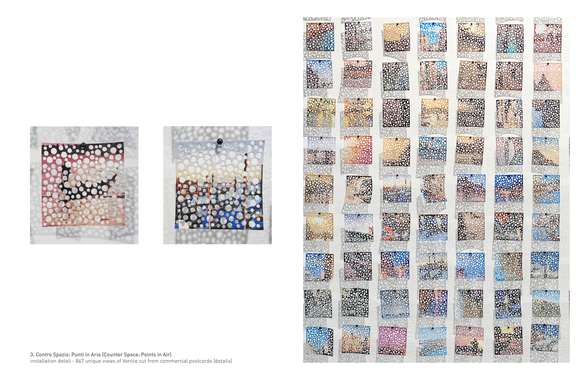
Inspired, in part, by the unique lace made on the island of Burano [Punto in Aria] and the ways in which this material underscores the individual, yet connected, geography of Venice and the larger lagoon, Contro Spazio asked viewers not only to reconsider their immediate physical relationship to the city, but to contemplate their complicity in the ways in which the city is represented and consumed.
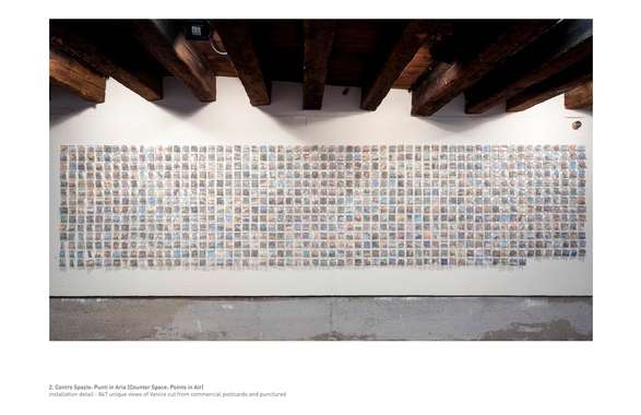
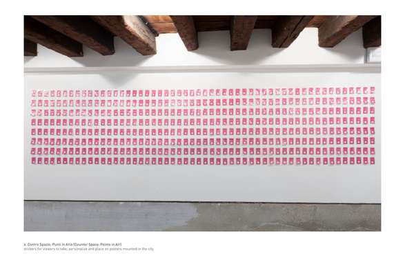
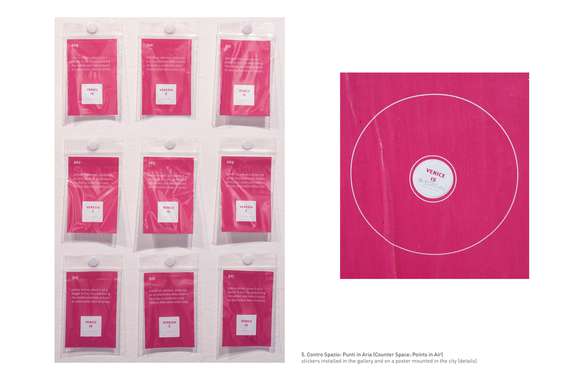
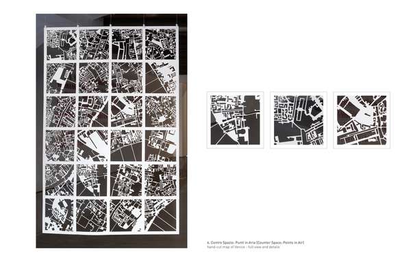
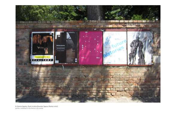
The installation consisted of 24 hand-cut street maps of Venice, 847 hand-perforated postcards [a quantity which marked the increase in the number of tourists - 847,000 - visiting the city between 2009 and 2013], 424 stickers (in English and Italian) that could be customized, and one-hundred posters [in English and Italian] mounted throughout the historic center of Venice. Opening a dialogue between the space of the street and the space of the gallery – the posters that were installed [officially by the city of Venice], instructed passersby to visit the SG Gallery, view the installation, select a blank sticker and personalize it by adding their own interpretation of Venice. The audience was then instructed to return to the streets, find one of the project posters and add their sticker to the poster.
Ultimately, this journey [from poster to gallery to poster] was designed not only to bring attention to the commercial postcard as a site where personal and public perspectives of Venice collide, but to emphasize the ways in which the poster constitutes its own form of public space. Of the stickers installed in the SG Gallery, approximately 97 were taken by visitors and applied to posters on the city streets over a three-week period.
What kind of communication approach do you use?
The point of the project was to encourage visitors and residents of the city to reconsider the ways in which tourism has fashioned an image of Venice (in many ways, the quintessential tourist city). Displayed during the Biennale di Venezia 2015 (although not an official part of the exhibition), the project not only allowed for the inclusion of multiple voices in this reconsideration, but a blurring of boundaries -- between gallery and street; between object and advertisement.
What are in your opinion concrete benefits to the society because of your communication?
In many ways the social impact of this project is difficult to measure accurately. Displayed on the streets of Venice, the posters had the potential to be read by large numbers of people walking in the city. What can be measured is that 97 stickers were removed from the SG Gallery during the period of the installation (suggesting engagement with the content / question posed as well as the intention to add these to the posters in the city).
What did you personally learn from creating your submitted work?
Because the project occupied a number of sites, there were aspects of it that I could control and others (such as the exact location of the posters - which were installed by the City of Venice) that I could not control. Given the ways in which the posters were installed, (sometimes alone and sometimes in groups), I learned that there could be potential ways to have them interact with their surroundings in additionally provocative ways. Because I will return to Venice to do another installation of this type, I am already considering ways to encourage more interaction between the physical space of the city, visitors to the city and the gallery itself.
Why is your work, GOOD communication WORK?
-
Where and how do you intent do implement your work?
-
Did your intervention had an effect on other Media. If yes, describe the effect? (Has other media reported on it- how? Were you able to change other media with your work- how?)
-
Curators Comments
Darren Tofts
An elegant and beautifully enacted project. The work consciously and astutely uses the city of Venice as a found object: a place of galleries, wall space in public places and a labyrinthine maze of streets to entrance viewers into unique experiences of discovery. For me there is much pleasure in turning a corner and happening upon art/design/pictorial conceits that by nature and design have a limited and indeterminate life. Like the lapwing whose mortality is very short, its presence makes for much pleasure to be savored and remembered. Lovely project.