MONEYCREATES DEBTSCREATEDOTCOM Campaign and Interactive Forum
by darren_k
This work has not been commented by curators.
Title
MONEYCREATES DEBTSCREATEDOTCOM Campaign and Interactive Forum
Headline
MONEYCREATESDEBTSCREATEDOTCOM
Concept author(s)
Darren Kennedy
Concept author year(s) of birth
1972
Concept author(s) contribution
Project concept generation, design concept, research, development and construction.
Concept author(s) Country
Australia
Friendly Competition
Competition category
Visual communication practice
Competition subcategory
static
Competition field
academic
Competition subfield
student
Subfield description
Queensland College of Art, Design Faculty, Bachelor of Design
Check out the Debt. 2012 outlines of Memefest Friendly competition.
Description of idea
Describe your idea and concept of your work in relation to the festival outlines:
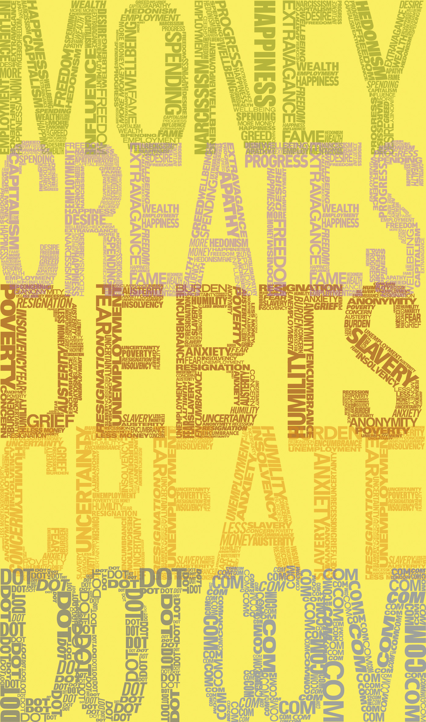
This campaign was designed to highlight the sources of money and debt creation and the inseparable link between the two and offer a resource that can be used to compile research and discussion in order to put as many minds together as possible and find an alternative to our debt laden society. The poster attempts to raise public awareness and questions the necessity of the money cycle. The poster invites the audience to question the various statements it makes by typesetting the extenuation of the statement into the letterforms of the campaign name. The poster promotes a new kind of online forum, one that is designed to publish research and debate on the subject of debt and money in order to possibly find a viable solution to these problems.
What kind of communication approach do you use?
The approach used for this poster is based on typographic and colour usage strategies. The typographic approach was based on some simple rules for example the neglect of serif fonts in the message. The typographic approach may be seen as conservative but the intent is to establish that the answer lies in the future and not the past. Society's dependence on centuries old systems is the reason that it suffers from the financial ills it faces today. The word 'MONEY' is green to represent the colloquial association with the colour green to that of money as well as connoting the suggestion that the concept of money may be aligned to that of a growing organism that lives off society. The word 'CREATES' is purple to reflect the global conception of happiness and how the pursuit of money is viewed as the path to achieving this. The word 'DEBTS' is red to represent the common colloquialisms associated with debt such as being in the red, as well as the psychological connotations associated with red and the adverse emotions that stem from the onset of massive debt. The word 'CREATE' is orange to represent the hunger that society has for consumption and lifestyle and the energy behind debt creation. The words 'DOT' and 'COM' are black and blue respectively in order to represent the use of technology as one of the advances that society can use to it's benefit in order to solve it's most challenging problems. The poster backing is a bright yellow to represent optimism, positivity and discovery. These elements have been selected and combined to create an overall sensation of friendliness, curiosity and invitation.
What are in your opinion concrete benefits to the society because of your communication?
The communication intends to boost public awareness toward the fact that the debt cycle is growing and needs to be urgently addressed. One of the benefits to society from this communication is the suggestion that the more resources that are available in order to find a long-term solution to the problem, the faster and more likely the chances of finding one are.
Society has a resigned attitude toward reliance on debt. One of the benefits of this communication is that it highlights the detrimental effects of this embattled mentality that there is no alternative.
Another benefit is the promotion of advances in technology and communication by the poster's obvious embrace of the Internet and pointing out its potential value.
What did you personally learn from creating your submitted work?
I learnt that good communication design must be approached from a number of different viewpoints in order to deliver the right message. The approaches and concepts you develop might not be necessarily as effective or as strong as you think they are going to be and need multiple third party opinions to achieve a high level of resolution.
Why is your work, GOOD communication WORK?
The poster's eye-catching appeal and simple construction is capable of resonating with a wide audience. The name of the site acts as a tagline that is intended to be catchy and raise levels of curiosity as to the general nature of the forum especially when the poster's subliminal messages are revealed on closer inspection. The poster encourages the viewer to engage with the various messages encased within the adopted typographic style of its make-up. This could only encourage participation and activity to the forum.
Where and how do you intent do implement your work?
The campaign is poster and billboard oriented that would be most effectively placed in major cities around the globe in their busiest of public spaces, university campuses, shopping malls and entertainment precincts and visible along main roads and high exposure areas. The corresponding forum is online from the moment the campaign is implemented, offering first-time visitors a free tutorial on the purpose of the forum and how to interact with it.
Did your intervention had an effect on other Media. If yes, describe the effect? (Has other media reported on it- how? Were you able to change other media with your work- how?)
No. Not until the concept is developed further and implemented.